Q:
Whatever happened to Running Rhino & Co.? Are they still around?
A:
These days, Running Rhino & Co. exists only as a lovely memory for those lucky enough to have experienced the magic in real time, back in the day.
Running Rhino & Co. began as a Seattle-based greeting card company in 1988. Over time, journals and notecards were introduced into the mix, eventually joined by gift pillows, photo albums, incense, and an eclectic assortment of ever-evolving, highly-sought-after gift items.
The original artists/owners began working with a third partner in 1994. The trio continued to run the show until 2001 when they transitioned into a cooperative partnership/licensing deal with another small Seattle-based company. That relationship lasted another dozen+ years.
Although genuine authentic Running Rhino branded products are no longer produced, bona fide Running Rhino items have been known to surface on Ebay every now and then.
Additionally, the original artists (Ian Challis & David Roos) continue to offer a limited selection of designs through their Redbubble storefront.
https://www.redbubble.com/people/challisandroos/shop

Background
Ian Challis & David Roos met in 1982 as students at the University of Washington in Seattle. While they graduated in 1985 with degrees in architecture, both realized their passions were calling them to investigate opportunities in the world of art.
While developing a game plan for their future careers, Ian spent a few years working in the offices of various architects and architectural photographers, while David found a gig in the art department of a wholesale business that specialized in manufacturing/wholesaling decorative windsocks. Those jobs provided the newly-graduated students with learning experiences and surprising perspectives into some non-architecture-related fields. However, the employment they’d landed upon felt somewhat limited in terms of creativity and independence.
Additionally, as committed life partners (since marriage equality wasn’t yet a thing back in those days) Ian & David longed to spend their days working together, rather than riding different buses every morning to opposite sides of Lake Washington to work in separate places.
So right there in their tiny one bedroom Capitol Hill apartment, an idea began to brew.
“You know those cards we’ve been making for each other for the past couple years?”
“The ones with the cute drawings, collages, and hand-carved rubber stamp designs?”
“Yeah… What if we put together a batch and take them out to show around the neighborhood? Wouldn’t it be wild if some store owner actually lets us put a few cards on their shelves?”
“Can you imagine? That’d be such a kick to see some of our little cards on an actual store shelf…”
“Wanna give it a go?”
“What’ve we got to lose? Worst thing is that we’ll end up with some cool leftover cards we can send each other…”

Timeline
1988:
In early 1988, Ian & David took a basket of their handmade rubber-stamped cards to a handful of local shops. Because they didn’t know any better, they hadn’t even considered the notion of making appointments. Who could’ve ever imagined that “cold-calling out of the blue” might be a viable route for success?
“We knew literally nothing that first day— didn’t even know the basics of the wholesale world. We thought we’d be lucky if we found one employee in one shop that might let us give them a few cards and then maybe at some point we’d eventually get a little money if they sold?”
By the end of that first day, FOUR store owners had placed orders. (Sure, they were tiny orders, but still!)
Ian & David were beyond excited.
“What in the world… ? Is this somehow gonna actually WORK?”
“I guess me might need to print order forms?”


1989:
1989 found Running Rhino digging further and further into the various nooks and crannies of the Wonderful World of Handmade Cards. Every card still made one piece at a time by Ian & David.
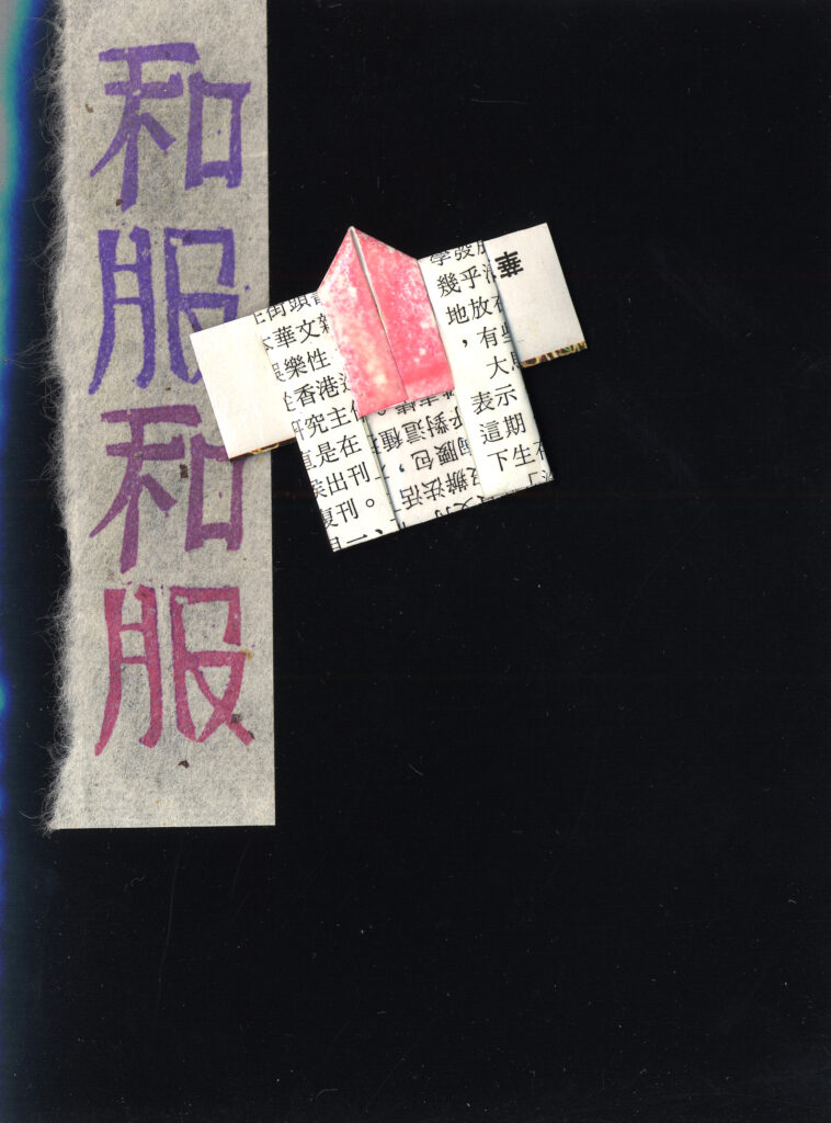
Handmade Origami Pin Cards— each card featuring a hand folded, varnished and decorated functional/wearable pin. They were difficult to mail successfully, (the pinbacks had a way of getting mangled in the postal process) but oh so cute!
Handmade Kanji cards— an outgrowth of the original hand-carved rubber stamp line. A hand-stamped Kanji symbol amidst layers of really cool, hard to source Japanese & domestic fine papers.
Handmade Watercolor Raindance cards— layers of watercolored, hand torn strips of a cool “Stonehenge” paper stock. These were really time consuming, messy, and used a really unhealthy amount of rubber cement! The parallel lines, representing rain, were made with a fork— which was charmingly dubbed “metal art rake” in the sales materials.
Handmade Metallic collage series— layers of really nice imported papers with center decorations made with really toxic metallic paint and/or super-toxic metallic gel pens.
But the staple of the line was the Pastel Brushworks collection. Each design made one by one, using hand cut stencils with layers of brushed pastel chalk dust. (And then taking each piece out to the fire escape to spray with a highly toxic fixative to hold the pastel dust in place…) Very messy to make, but very cool to look at!


1990:
Ian & David threw caution to the wind and invested in their first batch of printed cards! Hooray— what a liberating feeling to NOT make each and every card by hand, one by one. Now, when an order was faxed in, one could simply go to the box of inventory and count out a dozen cards, grab a dozen neon-colored envelopes and put them into a box. Presto!
But some of the sales reps didn’t take to the idea at first. “You’re a handmade line— it’s the thing that makes you special.” But by that time Ian & David had seen a vision of the future, and that version didn’t rely solely on the artisanal, handmade process.
The Rhinos began with three series of printed cards. The Watercolor Poetry series (The most successful of the three), The Egyptian Hieroglyphs series (which enjoyed limited success in some museum stores and New Age shops), and An Ark Of Animals— a series that the artists loved, but customers seemed to…. what’s the word… loathe. (A rather strong word, you say? Yes, yet sadly accurate.)


1991:
OK, so even though Running Rhino had entered the world of Printed Cards, they realized the Handmade market was something that shouldn’t be totally ignored. So… enter the new Handmade Collage series. The thing that made those cards a little less time consuming was the reliance on colored copies. Each piece was still hand cut, hand glued, etc… but color copies were a relatively new technology and (time wise) quite a godsend.
Also, 1991 saw the release of the printed version of the formerly-handmade Pastel Brushworks series. (Yay— the years of constantly inhaling fine pastel powder and spray fixative had come to a merciful close!)


1992:
1992 saw a major dive into some expansive new seas.
In January Running Rhino added to the existing line of printed Pastel Brushworks cards, which was by that time sometimes referred to as the “Paper Planet” series.
March saw major additions to the Winter Holiday collection and the creation of a line of heart-shaped die-cut watercolored floral cards.
But the biggest changes came with the debut of the big new Spring Release at New York’s National Stationery Show in May.
Ian & David decided to shake things up a bit and experiment in some totally uncharted territories.
Mondo Frames— These looked cool, but used so many toxic chemicals (hot glue, copious amounts of metallic spray paint), were really time consuming to individually craft, and nearly impossible to ship. Mondo Frames became the first Running Rhino product line to go both INTO the line and OUT OF the line within the same month!
Walk Spirit Talk Spirit— David had been writing songs and making music for pretty much his whole life, so it seemed natural for Running Rhino to release a cassette of his contemplative solo piano improvs. Sales weren’t exactly brisk, but the tape provided pleasant background music in the trade show booth.
(just for fun, you can hear that album here: https://davidroos.bandcamp.com/album/walk-spirit-talk-spirit )
BUT the big hit of the show (and one product that really set The Rhino running in a new direction) was the introduction of the much-beloved Rhino Journal. Even though initially available in only one color (earthy brown) and one size (7” x 8.5”) this product was included on nearly every order written at the show. Sales reps (eager to introduce the Rhino Journal to their accounts back home) had to do some tricky negotiating with each other to see who got their hands on the limited show samples.


1993:
1993 saw many new printed cards, and the introduction of some new artwork styles.
Collage style— a creative melange of found ephemera.
The “Awake!” style— colored pencil and watercolor, mixed with some elements of collage.
New Age Watercolor style— heartfelt renderings of dreamlike scenes and scenarios.


1994:
In January, the duo became a trio when Carter joined the merry band. Ian & David continued to do the artwork, design the products and source the goods, and Carter managed the growing network of sales reps and tended to licensing opportunities, trade shows, PR needs, and so much more.
There were some new additions to the card line in the Collage style and the Paper Planet style.
Also, the Rhino journal became available in 3 sizes, 3 colors.
In May, a brief foray into the world of wrapping paper spearheaded the whole company to move into a larger office/warehouse in a whole new part of town. (Who could’ve guessed that enormous flat sheets of wrapping paper could take up so much floor space??)


1995:
New year— new formats!
Stationery sets— at the National Stationery Show in NYC in May, Running Rhino introduced single-color stationery sets with petroglyph-style artwork (which at that time coordinated with the signature envelopes that accompanied the card line.) Seemingly one question was on every buyer’s lips— “so… are these gonna be offered in color to match the rest of your art, or are we just stuck with the sepia squiggles and stuff?”
By September Ian & David released a full collection of full-color stationery sets. Yay!
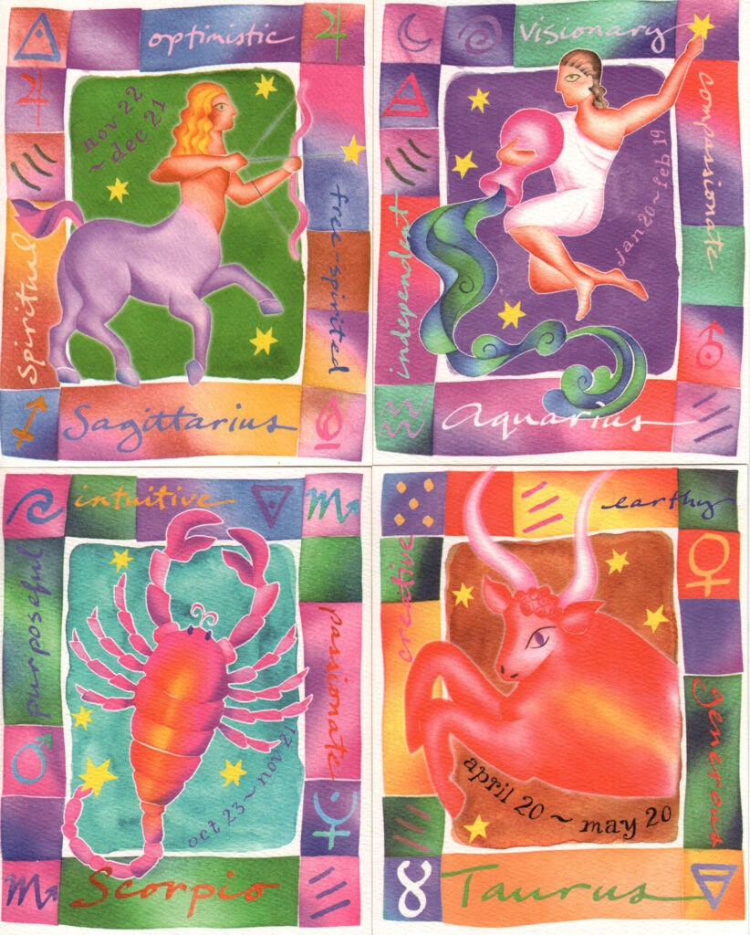
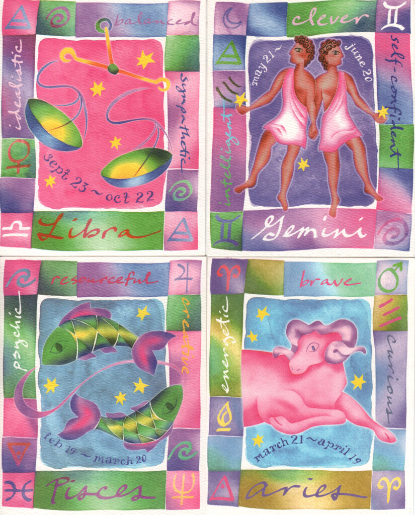
There was also the introduction of a brand new Zodiac series. A great idea that was perhaps just a bit ahead of its time?? Sales were sluggish at best. Perhaps Ian & David should’ve read their horoscope before rushing that particular artwork to the printer?
1995 was also the year Running Rhino went Hollywood. (Or at least had some very minor brushes with “fame.”)
Ellen— back in the 90s, Ellen DeGeneres had a weekly sitcom, which was pretty popular. Her character (also named Ellen) owned a book store called “Buy The Book,” (because we all loved puns back in the 90s.) Front and center at her store (as in myriad Running Rhino bookstore accounts back then) there was a big freestanding “spinner” display of greeting cards, entirely made of up…. You guessed it— Running Rhino product.
Brad Pitt— There was a movie called “12 Monkeys,” and in it, Brad’s beleaguered character is under fire as he ducks for cover behind a glass display case. And the only product viewable inside the case? You guessed it— a Rhino Journal. The hunter green medium sized one, to be specific. With the design on the front that Running Rhino’s catalog called “Walking Fish,” (ordering style number P-78)
Kenny Loggins— well known rocker. He was on a daytime TV show talking about his journalling routine and specifically referred to his “Rhino Journal.” (This fact was reported to David by his mother, who had been watching the show.)
Ghost Writer— cool kids program where a ghost communicates through writing. Apparently Rhino Journals were used on the show. Sales reps would hear rumblings from store buyers about how this was in fact true, however Ian & David saw no familiar looking items during the 2 or 3 times they watched.
The Beautiful Authentic Zoo Gods— Indie band from LA who had just been signed to a label. One of the band members had come across Ian & David’s “Birth Of Light” Solstice card and asked to license the design for the cover of their first release.

1996:
The words that Queen Elizabeth spoke in 1992 became words that Ian & David would frequently quote during 1996:
“This is not a year on which I shall look back with undiluted pleasure. In the words of one of my more sympathetic correspondents, it has turned out to be an annus horribilis.”
Due to situations beyond anyone’s control, Carter needed to spend much of 1996 working halfway across the country on a another project. Nevertheless, Ian & David toiled to keep the Rhino running. Since the beginning of the company, sales had increased every year —sometimes even doubling. 1996 was the first year to experience flat sales.
Despite the unavoidable intermission, there were some new product offerings.
Boxed notes, and additions to the existing parts of the rest of the line, including new sizes and colors for the Rhino Journal.
As well as some new art.


1997:
At the end of 1996 Ian & David prepared for Carter’s return by totally reinventing their color palette. The goal for previous years had always been to go as bright, punchy, and vivd as possible. Jewel tones had been the major goal of every press check at the printing house.
But an early winter hike to Monte Cristo changed all of that. This walk along the south fork of the Sauk River in northwest Washington had long been a favorite of Ian & David. Barlow Pass trailhead was under 2 hours away from Running Rhino’s studio, and a frequent day trip— a perfect venue for clearing the head and talking about product design ideas.
And, on this particular day— color choices.
“Isn’t this beautiful? So crisp, so clear.”
“It really is. I know we’re supposed to be thinking about our January line, but I’m just drawn to all these colors all around us.”
“I know what you mean— the lichen on the rocks, and how the tone gets darker when the rocks are underwater. It’s celadon, and then it’s pistachio… artichoke… chartreuse…”
“And that sky… it almost turns white at the treetops on the horizon. It’s like it can’t decide if it’s air or water, you know?”
“And check out the bark of that cedar as it goes from umber to sienna as the wind bats the branches back and forth.”
Well… on the way home, Ian & David stopped at Daniel Smith Art Supplies to choose a new palette of pastels. Pastels which would be ground into powder and brushed into all of the new artworks for the radically-shifted January line.
Ian and David’s printing rep called and left a message when she received the SyQuest disk containing their artwork for the print job.
“Just wanted to make sure this was the finished art? It looks a little…. Um, different? Well, gimme a call…”
Ian & David had a similar reaction when they went in to press check the first sheet.
“Wow…… this is…..”
“Yeah….. Different. Is this OK?”
“Toto, I’ve a feeling we’re not in Kansas anymore.”


1998:
More, more, more— the theme of 1998.
Fortunately, the New Palette of 97 was a hit, with both new customers and longtime fans. This look continued to appear in artwork created in the new year.
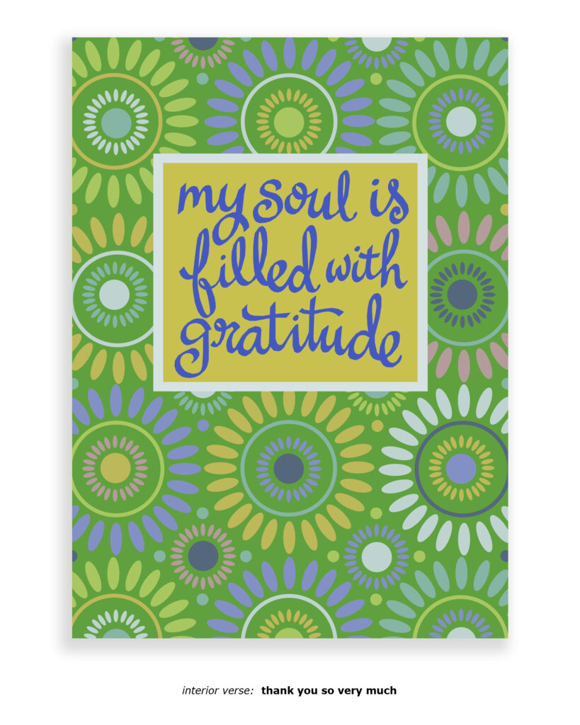
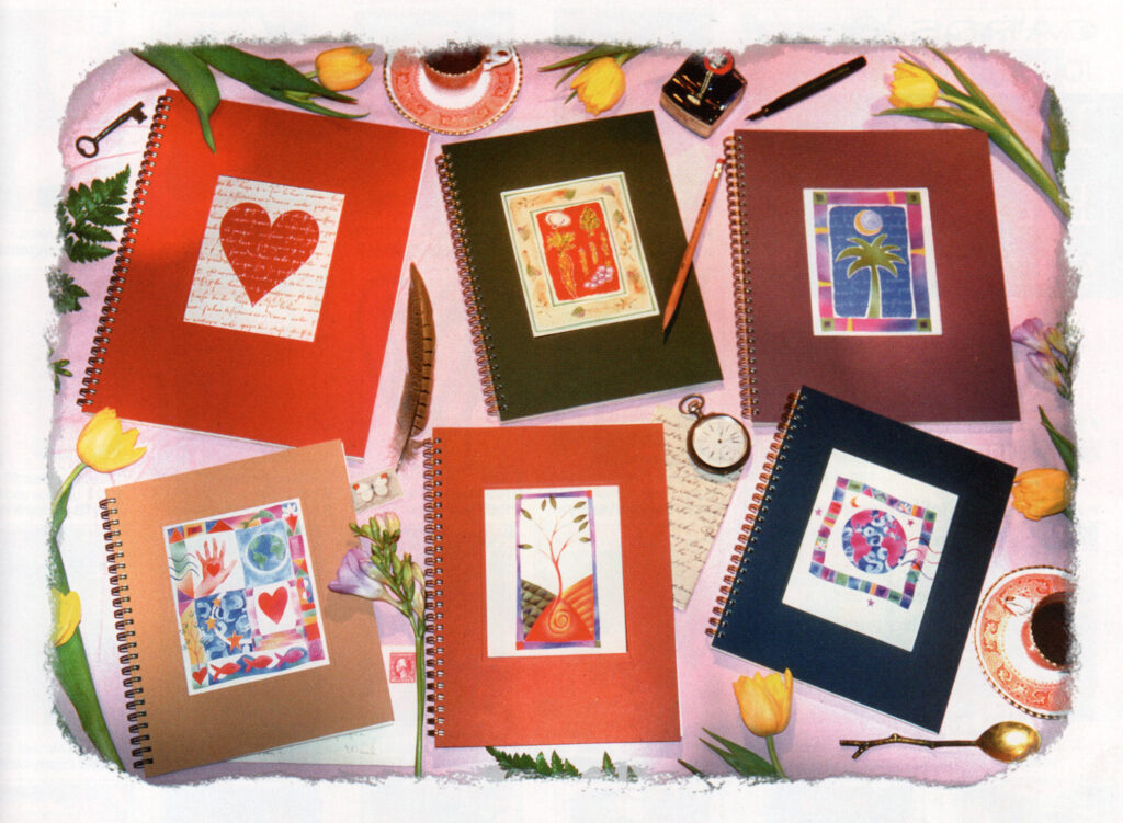
And Running Rhino saw the debut of “themed” journals with coordinating warp-around cover artwork and illustrations on each page. Travel Journals, Gratitude Journals, and a Love Journal for Valentine’s Day And Beyond.
And after working with the idea for over a year, at the Stationery Show in May, Running Rhino introduced its inaugural line of photo albums. 3 very distinct formats for 3 very distinct ways of archiving memories.
This new format also introduced the need for a totally new concept in cover images. Ian and David always thought of this photographic series (based on personal historic family photos, as well as pictures found in second hand shops around the Puget Sound) as being temporary images— just a place holder while the album was on a store’s shelves, to be replaced with the buyer’s own photo.
Also newly introduced, a new concept in boxed notes. Foil stamped design on the base, colorful image on top. These turned out to be very popular at some of the really large bookstore chains.
Oh… and also the Photo Journal. This product was unique, and a surprisingly good seller for something so idiosyncratic. Has the world seen such a thing before or since? Black pages for mounting photos alternating with lined half-sheets for lengthy captions, and a button-and-string envelope for 2-sided mementos.
And as a side project (not available as part of the regular line of Running Rhino projects,) Ian, David, and Carter teamed up with the singer/musician/songwriter Jewel to collaborate on a version of the Running Journal to be sold at merch tables on her 1998/99 concert tour. (Jewel provided the black and white sketch for the cover artwork, and then Ian & David added watercolor and designed the rest of the Jewel Journal.)
This journal had historical significance. It was the only product ever sold under the Running Rhino name to feature the work of an artist other than Ian or David.


1999:
1999 continued 1998’s theme of “more, more, more.”
At long last, after many customer requests, Running Rhino offered some options for hard covered journals. Same options of cover imagery, but now with an extra-thick durable (ish) front and back cover.
And… the official Running Rhino Address Book— a total dream project for the designers (Ian & David.) Die cut tabs, gold foil, and lots of spot illustrations throughout.
“Goals” and “Dreams” were added to the line of popular Themed Journals.
New photo albums— the “Brown Binder” and the “Photo Fold-Out” album. And the “Seagrass Album,” which according to Running Rhino’s own catalog was cheekily labeled as “recommended.”
The “Seagrass Album” inspired a whole new series of cover images—- the Tinted series— based on Ian & David’s photographs.


2000:
A bit of a transition year.
Toward the end of 1999, Ian, David, & Carter embarked on one of their semi-annual “Biz Retreat Weekends” at a remote location in western Washington. It easily might’ve been Whidbey Island, it might’ve been Index… but this particular retreat was on Puget Sound’s Guemes Island. As they left the ferry and drove up to the rental cabin, one of them noted “wow, this house looks like the sort of place that’s kind of on the edge… it’s like I can almost imagine it all blowing up or something.” While it sounded ominous at the time, it ended up being just a statement of fact. By the end of the weekend all three realized they’d really been burning the candle at both ends. (And that made for a total of six candle-ends between the three of them.) They all knew it was time to make some impactful changes.
Some explorations into the world of licensing over the past couple of years had shown them that there was a viable way to grow their business in another way— one that was still infinitely creative, but involved no warehousing manufacturing, or supervision of employees.
The decision was made that weekend to begin the search for someone — some entity who could shepherd the everyday business of Running Rhino while Ian/David/Carter focussed on licensing.
“What if, like, we got to a point where Running Rhino wasn’t necessarily something we thought of as ‘ours…’ Maybe it could become somewhat of a licensee or something? Could that even work?”
So, the seed had been firmly planted. The process had begun.
BUT, the trio had to maintain the trajectory of the whole freight train that Running Rhino had become even as they dreamed of the future they all desired.
So, 2000 saw the introduction of a new Sketch Journal, new colors and sizes for the Classic Cover Rhino Journals, a Guest Book, and a new Photo Album format with easy-to-use slide-in plastic pages with caption strips.
There were also some colorful new cover images offered for the cards and journals.
But the really super-new look for color imagery was the debut of the photography-based Silverprint series. Subtle black ink on metallic silver stock. Striking, indeed!


2001
At the very end of 2000 Running Rhino’s deal was sealed with Madison Park Greetings. Both Seattle based companies, Running Rhino and Madison Park had known each other over the years, and the idea to work together seemed like a no-brainer. Madison Park could now do all of the employing, supervising, warehousing, manufacturing, and managing. Ian, David, and Carter could now devote all their time to artwork, creativity, and licensing. Cool!
2001 saw the introduction of a new category. Gift Pillows— little gift boxed, lavender/flax seed-filled, velvet-backed sachet pillows. And a small selection of coordinating Eye Pillows.
In May, the Rhino Jotter was introduced in New York. Small, soft-covered, tape bound retro mini journals, available in three different versions.
Also debuting was The List Book— a tall, lined, hard cover Rhino Journal.
Also, Running Rhino’s first-ever (and only?) “Baby Book — A Mother’s Journal.”
And in the Photo Album space, they introduced the “Single Shot Album,” the “Pop-In Album,” AND the “Silver & Gray Snapshot Album.” (As well as a pretty complete array of photo-related accessories such as paper/plastic refill pages and adhesive photo corners.)
Oh, and a full line of Incense (with really cool packaging!)


2002
2002 saw the introduction of:
— Birthday Book with colorfully decorated pocket pages for each month.
—A new blue/silver address book with new colors and artwork on the interior pages.
—A new twist on the line of Gift Pillows, adding fun tassels to the corners.
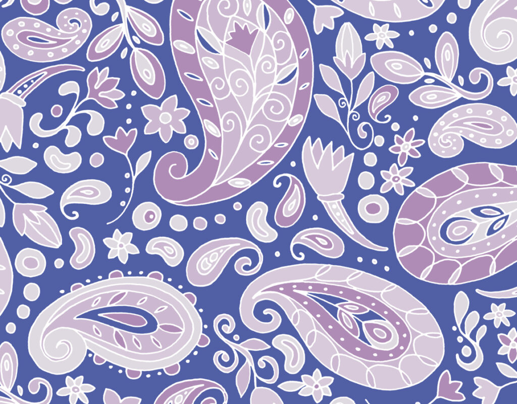
—Paisley, Impressions, and Shangri-La. Three new collections of notecard sets, each packaged in a box made from actual wood.
— Shangri-La Jotters with cool vinyl outer covers.
—Accent Lights. As the box stated, “Handcrafted alder wood base holds a printed translucent cylinder that gently illuminates the artwork.”
—Two new hard covered, plastic-paged photo album formats— the “One-Up Photo Journal” and the “Two-Up Photo Journal.”


2003:
2003 saw some new experimentation with new styles, new looks. Four new boxed note sets with four very different looks/styles. Wildflower Bouquet, Moderniture, Joie de Fleur, and Fruitwood.
Also:
—The Flowerbed AND Bulbs & Blooms AND Bois series of cards and cover images
—New Travel Journal with fun retro-style illustrated pages and cover images.
—Recipe Organizer with exclusive cover images.
—A full collection of brightly colored File Folders
—Magnetic List Pads
—The Rhino Sketch Journal
—2 linen-covered Rhino Journals
—3 suede-covered Photo Albums
— The “Photo Binder”— (aka “The Easy Album”) available in 3 colors
—New format for the address book— the “Address Binder” available in 2 colors
—2 suede-covered Guest Books


2004:
One goal for the new year was to develop a new, stylistically unique selection of products that could serve as a complete line all on its own. Something that would enhance the existing Running Rhino range, without diverting attention.
So, the Hudson Pinewood series was born. A retro, “scratchy pen” look with a subtly playful style. The collection was introduced with a full range of trifold greeting cards, gift pillows, and cover images for journals, cards, and photo albums.
Also debuting that year:
—The “Ring Ring” series of Journals (in 3 sizes), Photo Albums (in 3 sizes), Themed Books (in 3 options, Wine Notes, Garden Notes, and Travel Notes.)
— Wish Pillows (like the popular Gift Pillows with the addition of a “secret pocket for dreams, wishes, and memories)
—The Color Sketch Journal — like the popular Sketch Journal but instead of neutral cream pages, the journal danced through an assortment of 6 rich colors


2005:
New additions to the Hudson Pinewood line. Greeting cards, cover images, gift pillows, and a new format for note cards, correspondence cards, gift enclosure cards, and invitations.
Also new additions to all those same categories for the “Running Rhino” look.
As well as 3 new formats:
—the Greeting Card Organizer, with it’s own selection of 3 unique cover images
— The “Photo Album Box”
—Mini Message Pillows


2006:
After a brief dip into the Hudson Pinewood pool, the focus shifted back to the more familiar Rhino look, with an emphasis on a somewhat brighter watercolor/collage look. (There were no new additions to the Hudson Pinewood collection after the middle of 2005.)
—New packaging for Note Cards (keepsake box with magnetic closure)
—Banded Mini Journal
—Hard Bound Linen Cover Journals (in 3 colors)
—2 new suede-covered Guest Books
—Additions to the line of greeted note cards, invitations, gift/eye pillows


2007:
Ian & David introduced a new art style that they called the “Paro International” look, named after Bhutan’s international airport. It debuted on tall die-cut notebooks, matchbox-style notecard sets, gift pillows/eye pillows, and cover images.


2008:
Two new art styles:
—Arlanda
—Fårö
(No new formats this year, but the 5 Rhino Journals were all re-tooled to all share the exact same size.)


2009:
Three new art styles:
—Wild Tamarind
—Copenhagen
—Aspenwood
—WordColor


2010:
Three new art styles:
—Tangletown
—Bilberry
—HW (“Hickory Wind,” a Gram Parsons reference)
—A new series of die-cut notecards and die-cut counter cards


2011:
Four new art styles:
—Andreas
—Sierra Azul
—Geo Fauna
—Energetic Geometric
—Foiled notecards, notebooks, and 2 note paper boxes


2012:
Three new art styles:
—Via Lola
—Baltik Graphik
—RZ


2013:
By 2013, Madison Park (the manufacturers of the Running Rhino product line) wasn’t seeking to add to the line in general, except for possibly a few standard greeting cards. Ian & David designed a batch of proposals, but (to date) nothing from that particular collection has been published.


The Rhino Journal
A lot could be written about the Rhino Journal. It basically deserves its own website. When it was introduced by Running Rhino in May of 1992 it was totally unlike anything the industry had seen. By May of 1993 there were dozens of companies offering similar items, if not exact duplicates.
So, was Oscar Wilde right all along? Is imitation truly the purest form of flattery?
A better question might be “So, Ian & David… tell us— what was the inspiration for creating the Rhino Journal?”
Well…
In December of 1991 Ian & David decided to take a little break— just a short two and a half week trip to Europe. They knew the journey would be a true adventure. The plane reservations had been made, but there were no pre-booked hotels, no set itinerary. Ian & David only knew that on a certain day they’d fly into Amsterdam, and then 18 days later they’d fly from Paris back to Seattle. What happened between those flights was going to be unplanned and totally impromptu.
They both knew they’d want to journal and sketch during their travels, and so before the trip they went shopping for the perfect product. They were pretty disappointed in what they found.
At that point, the main options in the journalling/sketchbook market were either very inexpensive “office supply’-like things, or really high end bound books with tooled leather covers and gilded pages. The cheap options felt too temporary, and the higher priced ones not only felt way too “fancy,” but the tight binding made the books difficult to use for either journalling or sketching.
Ian and David wanted to find something right in the middle— something that felt substantial, but not fussy. Something with a nice high quality feel, but inexpensive enough to use without fear of “using it up.”
During the trip, they continued talking about the books they’d hoped to be using rather than the ones from Urban Outfitters that they’d been stuck with, and kept trying to make work.
By the time of the NYC’s Stationery Show in May Ian & David had managed to produce a few prototypes of the journal of their dreams. Wire-O binding. Thick cover stock, that was still bendable. A huge selection of tipped-on imagery. Hearty interior pages that could be used on both sides without show-through. Sturdy backboards which almost served as a portable easel.
And, of course, every paper component was recycled, printed with soy inks, instead of petroleum.
People liked what they saw, and orders started coming in. Ian and David were tickled by all of the “fan mail” they’d regularly receive. Such touching messages. The line expanded through the years.
Timeline of Studio Spaces
1988:
Ian & David’s one bedroom apartment on Seattle’s Capitol Hill, in the slightly-famous Biltmore Apartments on East Loretta Place.
1990:
Ian & David continued using their apartment (#208) as a studio and creative space. All other operations, including shipping, moved into a tiny studio on the ground floor, much to the UPS driver’s relief.
1991:
Order Entry, Warehousing, Production, Packaging, Shipping all moved from #119 to a slightly larger one bedroom apartment (#319) two flights upstairs. (Apologies to UPS…)
1994:
The big move across town to an actual commercial space. 155 Western Ave W, in the super-cool Northwest Industrial Buildings complex, which is now called Northwest Work Lofts.
Running Rhino took over the space when Robert Fulghum (writer) moved out. Six years later, when it was the Rhinos’ turn to run along, the much-loved art studio transformed into a gym— Rain Fitness.
1997:
Ian, David, and Carter remained in the space at 155 to use as an art studio for Ian and David, and office space for Carter. The rest of the crew moved two doors down the street to an even bigger warehouse loft space at 169 Western Ave W (with its up-close view of the Seattle Post-Intelligencer globe, and its own loading dock that didn’t have to be shared with the temperamental neighbor!)
2000:
In October, everyone in the 169 space moved back to Capitol Hill, setting up shop in Madison Park Greetings’ spacious warehouse at the corner of 11th & Union.
2001:
Carter moved into his home office in Wedgwood (North Seattle), and Ian & David set up the art studio at their house on North Capitol Hill.


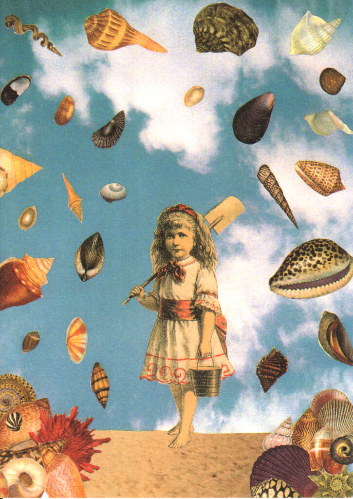
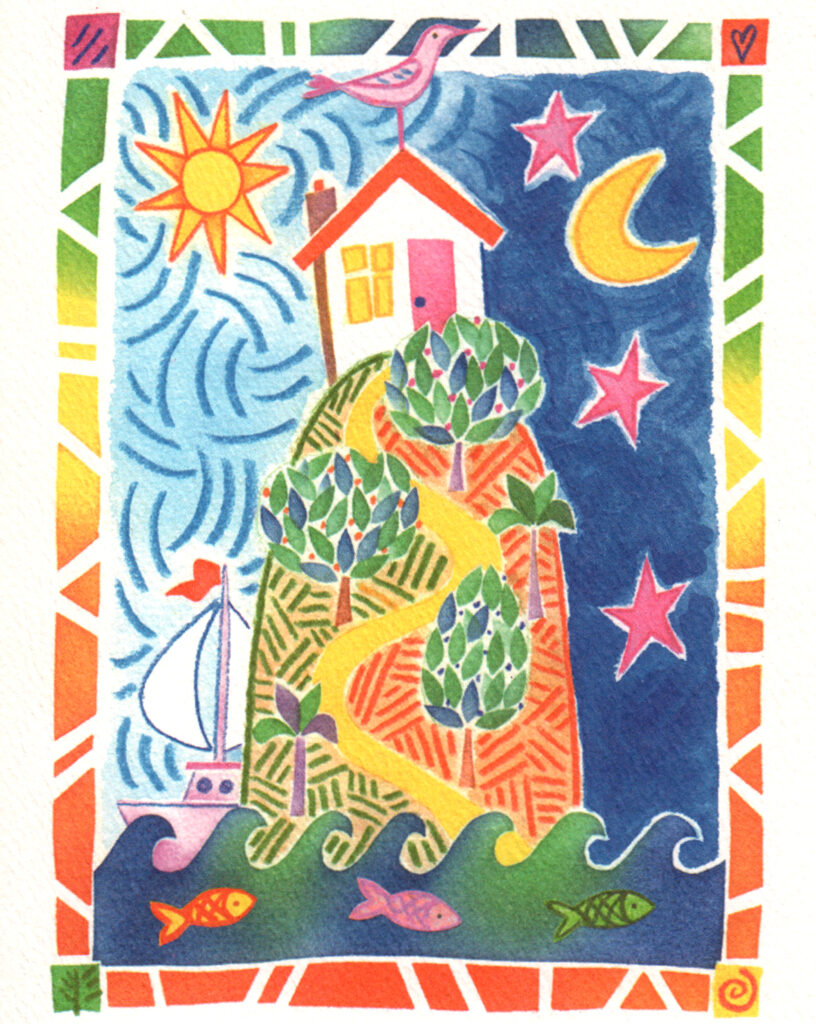
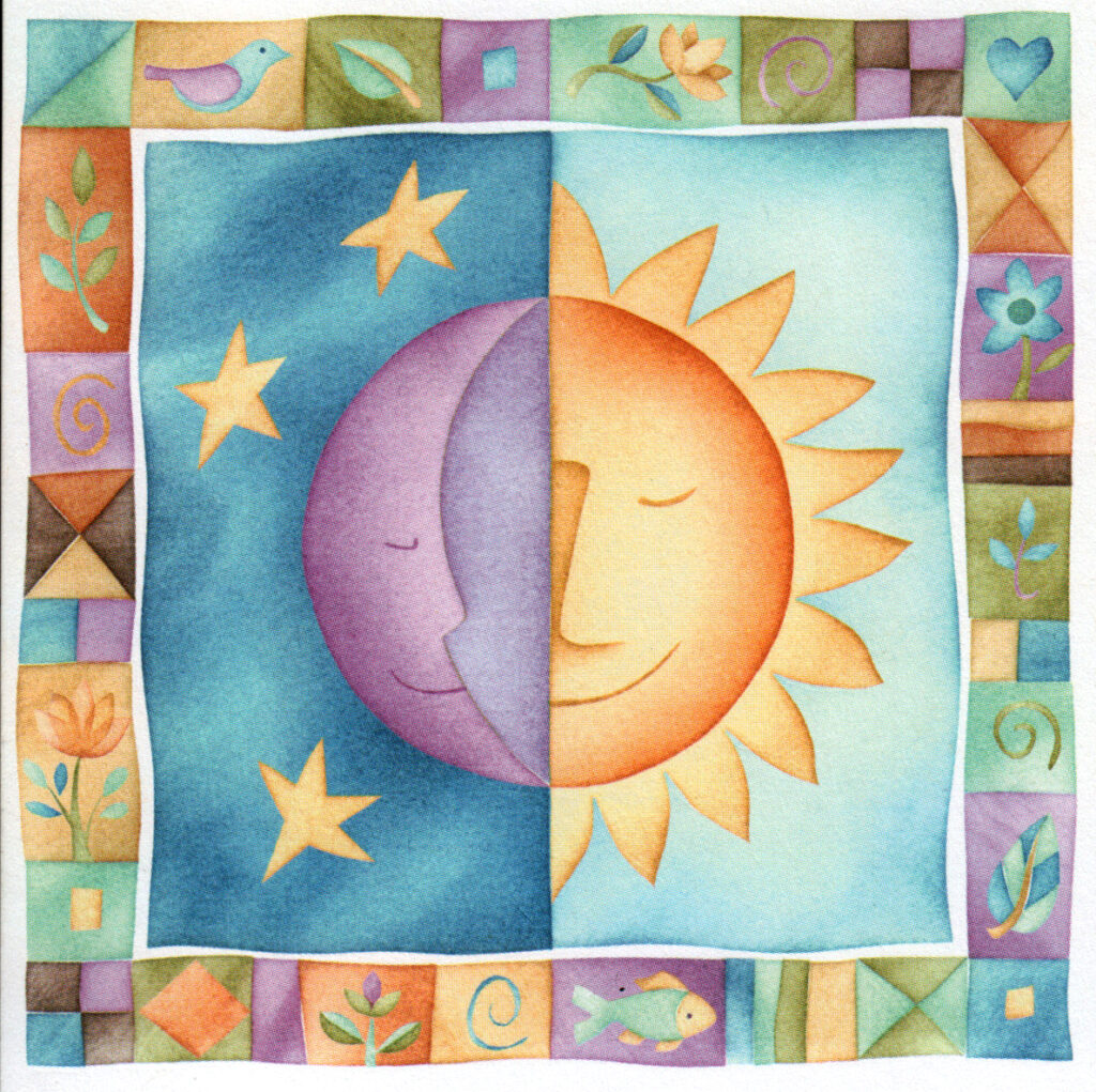
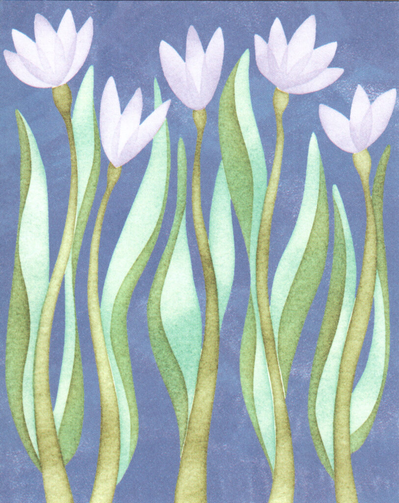
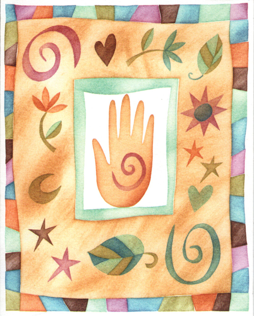
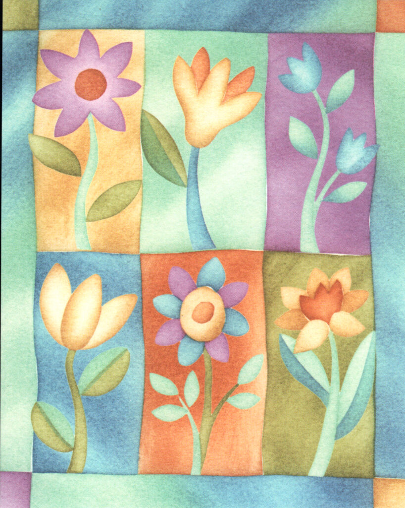
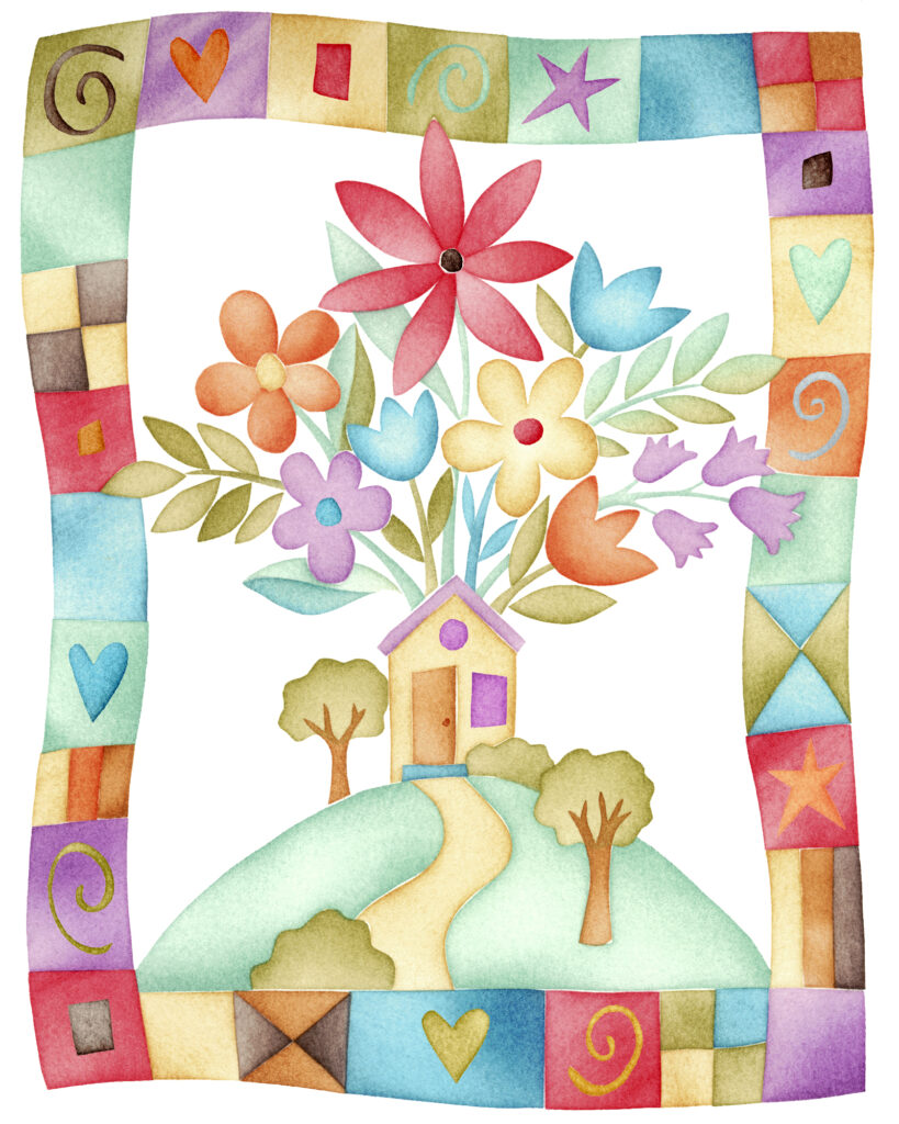
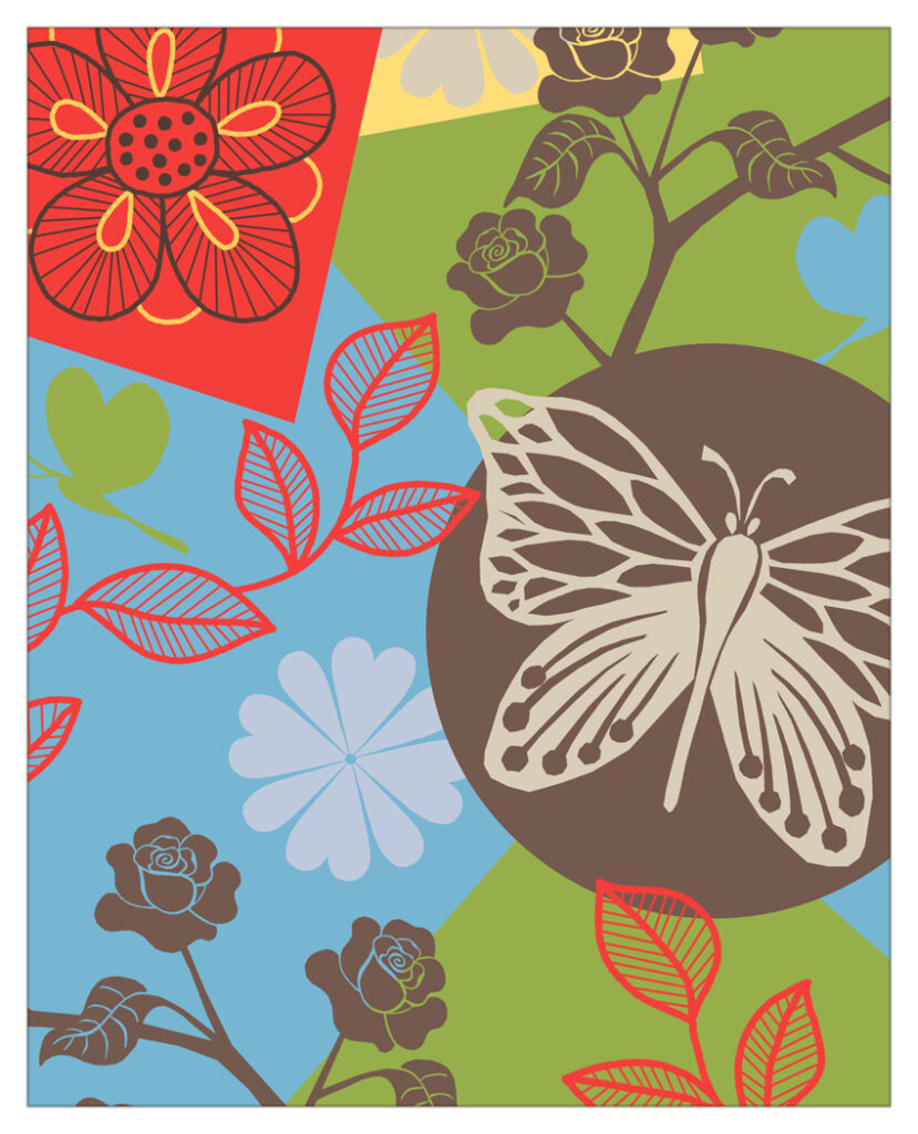
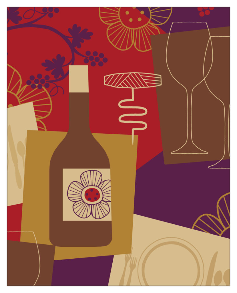
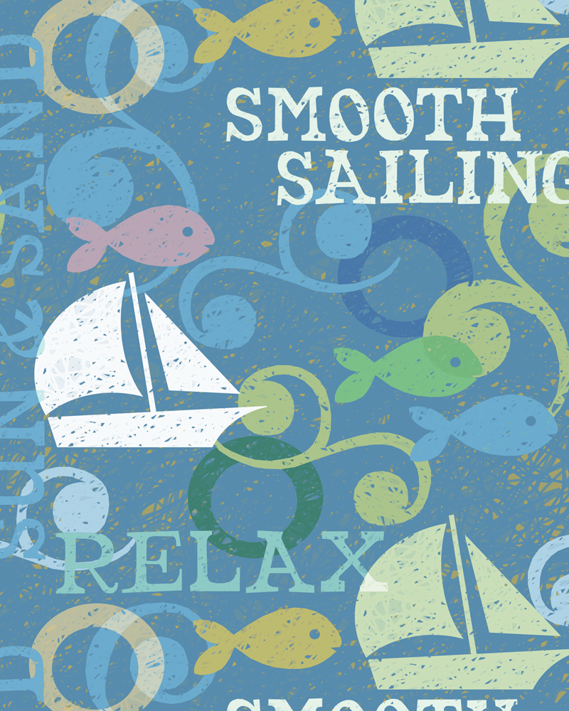
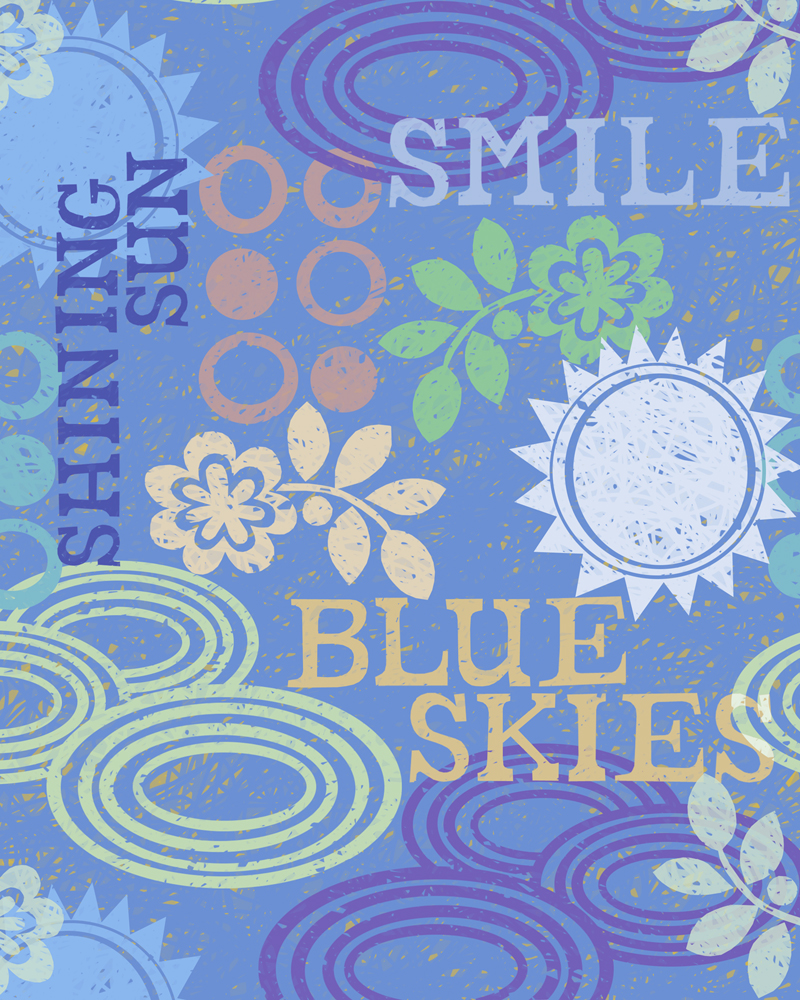
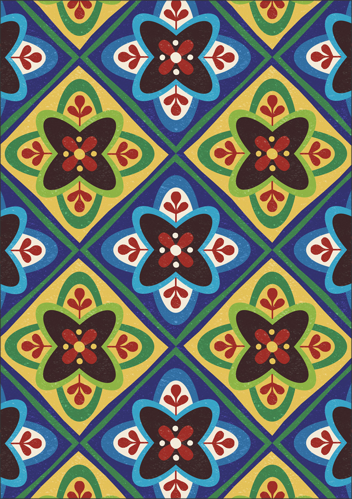
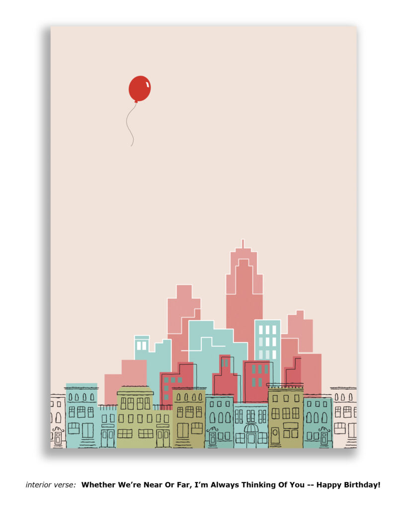
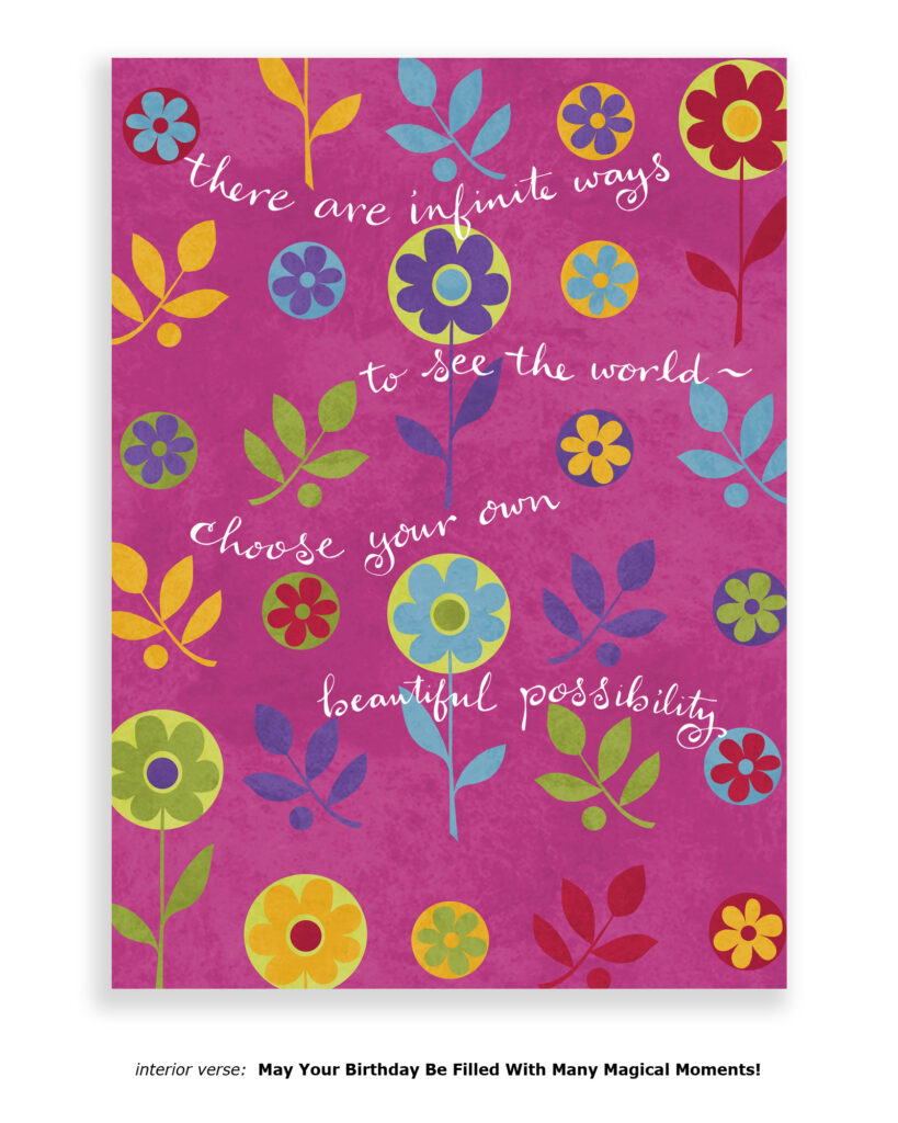
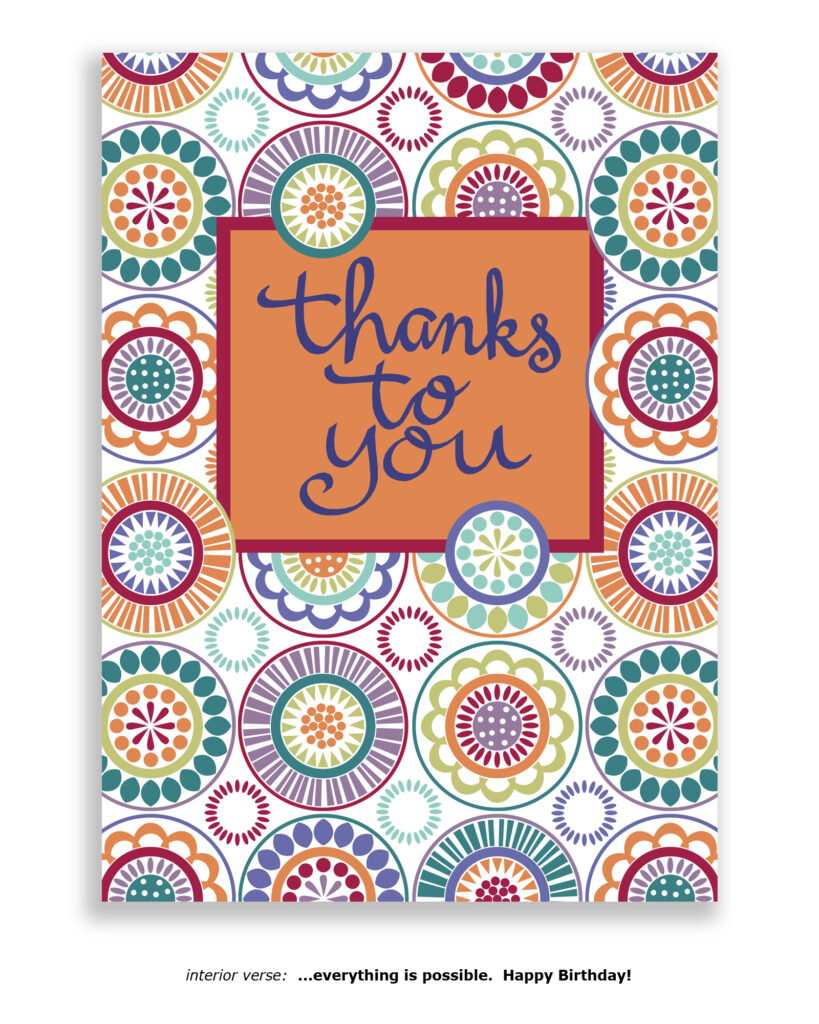
Catalog Covers:


Sales Reps
About three or four months after Ian & David hit the sidewalks with that basket of handmade cards, Christina Rockrise became Running Rhino’s very first sales rep. Ian & David will always be grateful that she saw something in that little Seattle-based card line, and generously shared her wisdom with a couple of dudes who had SO many questions. After Christina put the Rhinos in touch with some reps in other parts of the country, the ball started rolling.
Christina Rockrise Washington State / Alaska
Ken Wardrip in NYC
Mike Bianchi
the lovely and amazing Greg Brammer
Fabrizio Pagano
Carlos Diaz
Ginger McCleskey in the Bay Area
Debra Silverblatt
Sue Gatch
David & Kevin (The Planet Myra Guys)
Brian Thornhill
Diane Gustafson
Dolores Forcino
Howard Parker in Arizona & Hawaii
Steve Lange
Pamela Lee in Hawaii
Pegan Venzon
The Women of Wild & Tawney
David Arehart in Kansas
Mair Hill in Chicago
Trissa Garvis
Shirley Robbins
Wanda Hicks
Jenny Klain in Michigan
Steve Levine with The Card Compendium
Lauren Kooshoian
Anna Shipman
Missie Hensel
Elyse Alper
Stacy Kaye
Joann Baker Ahmad
Patti Sadorus
Tracy Parker
Pat Palmer
Donna Johnson
Marla Antonio
Richard Laughinghouse
Lori Watzman
Al Hattendorf
Ann McGilvray
Marsha Phillips
Spike Ritter
Janice Burton
Kree Kree Snyder
Stafford Gray
Debbie White
Luke The Motivator in Florida
Mike Ropefogel
Christine Downie
Jan Barese
Chanel Vigneron
Gerry Harrison
Sally Perlich
Jan Boudreaux
Betsy Stinson
Dusty Hawkins
(this is a partial list of the hundreds of independent sales reps that Running Rhino worked with over the years, written entirely from memory several decades after the final commission checks were sent, so pls forgive any unintentional omissions — and spelling errors, lol!)

Why was it called Running Rhino?
This is definitely one of those questions Ian & David wish they would’ve given more thought to back in the 80s when registering their first trademark, and setting up those initial business documents.
Truth is, they were just a couple of guys, newly in love, making cards for each other, writing random company names on the back of each one in an effort to be humorous and make one another laugh.
Each card had a different company name. Eggplant Press. Diva Enterprises. Silly Boys Ltd. Handmade By Mice, Inc., etc.
On the day it became necessary to list an official business name on the City of Seattle business license, they simply (somewhat capriciously) filled in “Running Rhino & Co.,” which may have been (possibly, although it’s been quite a while now,) somewhat associated with the movie from that era — “The Gods Must Be Crazy” — which featured a fire-stomping rhino in a comedic MacGuffin role.
It also may have had nothing at all to do with that movie, and perhaps that tale is just something that came out of nowhere during some future interview with some trade magazine?
Whatever the reality, it was always a question that Ian and David were asked in interviews, at trade shows, by their friends, etc.
At one point, grasping at straws at an industry show in New York, they even purchased a vintage teddy bear to prop up in their booth.
“We’ll name him ‘Rhino,’ and then we’ll have something to point to when people ask about the origin of our moniker.”
Ian and David had no idea what they were getting into. For years and years, fans and friends constantly sent “rhino” themed gifts. Stuffed animals, artwork, jewelry…. It was touching, and so heartfelt.
David remembers a point in his youth, sitting in the suburban shag-carpetted bedroom of his childhood home, watching the Johnny Carson show. Johnny had some long shaggy dog story that somehow involved a pair of hippos. The tale concluded with a highly unexpected line from one of the hippos to the other, “You know, I could’ve sworn today was Thursday…” Despite years of watching Monty Python, it was his first conscious introduction to the world of non sequitur.
Possibly the name “running rhino” is nothing more than that…. Just some random non sequitur based on the variable, ever-changing musings of a couple of sometimes creative dudes who had a vision to share their art with an untested world? Just an impulsive sobriquet to move the story along on its path to hopefully reach some new level?
Whatever the real reason, the name stuck. Fortunately, people took note and seemed to stick with it as well.
And for that, we (Ian & David) are forever grateful.

What’s Happening Now?
For several years after Running Rhino ended its rollercoaster-ish/bountiful run, Ian, David, and Carter continued to license Challis & Roos artwork to companies across the country and around the world. http://challisandroos.com
Eventually, all three ended up moving from the misty Northwest to magical Palm Springs, California. Carter took the initial plunge, with Ian & David following a few years later. The desert had been calling, and what a joy it was to finally pick up the phone.
Ian continued his studies in Buddhism and became an instructor of meditation and dharma, teaching at his local Buddhist sangha, and at residential retreats around the country. https://ianchallis.com
David developed a fascination with hot yoga, doing the whole yoga teacher training thing (but ultimately deciding he’d rather practice than teach.) He also continued his involvement with music and writing, performing at open mics, writing songs, writing novels, and self-releasing albums. http://davidroos.org
Ian and David think fondly of their days of running with the rhinos, and are very happy that all roads led them to their current life in SoCal with their delightful partner Shawn.

The past was an enticing appetizer. Let’s all get ready for the main course that the future is serving.